
Appalachian Travel Poster
Our process in creating our travel poster began with looking through pictures we both had, in order to see where the poster would advertise. After going through photos we found that we had excellent images of the Appalachian Trail and also of various locations in Italy. In addition to looking through these photos, we created a Bēhance collection with various images that we liked and used for inspiration. The project that most influenced our work was one that had been done for the cover of the "Boston Globe" and showed a small cabin in the woods, similar to our Appalachian photos. We then began to sketch what a poster could look like with these photos as the background. One of us drew posters using the Appalachian photos and the other drew posters using a photo from Italy.
Our Bēhance Collection: Link
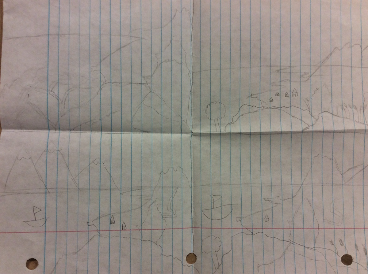
Appalachian Mountains Sketches


Italy Sketches


After sketching we decided that the poster that showed the most potential was the Appalachian Mountains one, however we kept the Italy poster to use as a second comp just in case. From sketching we were able to really envision the cropped view we wanted to take from the photo in the Appalachian Mountains. We took our photos and ideas to Mr. Davis who suggested that we combine aspects of our two best photos. We then began to create roughs doing this, putting the fog from the first photo in the background of the second photo.
Our Roughs


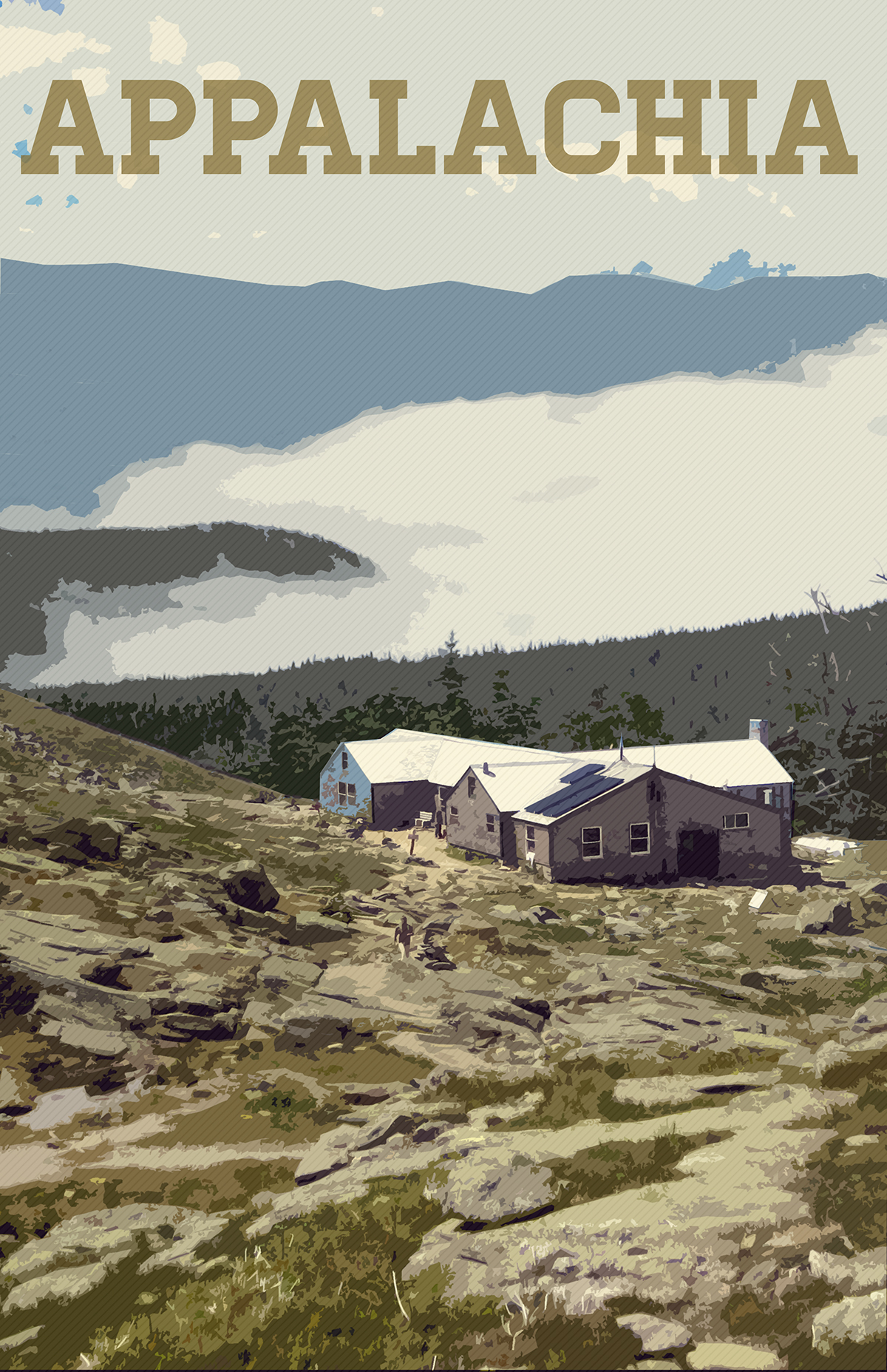
Appalachian Composition
After allowing Mr. Davis to review our work we began to use photoshop. This was the first real project that we were attempting to do in photoshop so there were many things we did not know how to do. We used a tutorial provided to us on how to make a silk screen poster to figure out how to apply a filter to our images to make them look like illustrations. We ended up using the filter "cutout" to get the illustration look we wanted. Then we had to ask for help from Mr. Davis to figure out how to cut out the fog and mountains in the background of our first photo and move this in between the layers of the second photo with the house in the mountains. We did this by creating a top layer out of just the foreground with the house and then pasted in the background we wanted and adjusted it to be behind the foreground. Once we did this, we began the arduous task of adjusting various lighting and color levels to have the photos look sharp and match up correctly. In addition to these adjustments we used a tutorial on Herbert Matter style posters (also provided to us by Mr. Davis) to add diagonal lines and a gradient that made the image truly look like an old-style, illustrated poster. We also found that text is something often overlooked in good design. We spent a while discussing the font, content, and placement of our text. We finally decided on a single-word banner along the top of our poster. In the end our final comp looked like this:
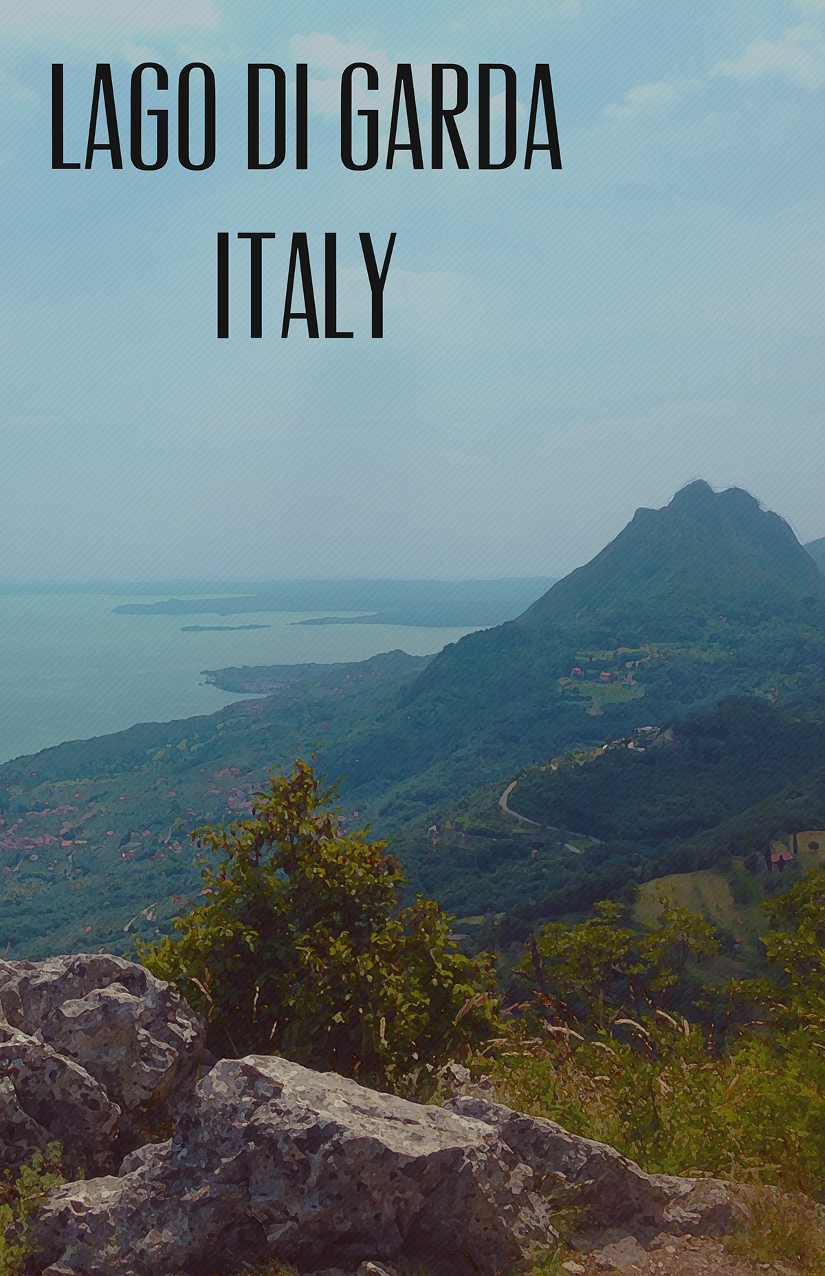
Italy Composition
After completing the Appalachian comp, we began work on our second comp which would be our Italy poster. This photo did not need as much alteration to add in features like the fog in the first poster, but it did need quite a bit of color and light adjustment. We added a filter called "dry brush" which made the photo look like it had been painted. After this we were faced with a problem. The sky in the photo seemed to be more overexposed than the ground in the picture so we needed to adjust them differently. In order to resolve this issue we cut the sky as a new layer and gave it its own adjustments. In doing so we were able to correct the lighting in the sky. We then added a gradient over the whole photo to accent the reds and blues in the photo in order to truly make the image pop. After doing this we added an old-fashioned, exotic looking font to apply our text. Our second comp came out looking like this:
In the end we believed that we had created two respectable comps, however we decided that we still liked our Appalachian poster better than the Italy one. We had originally decided this and also felt that we had put a lot of work into the Appalachian poster.
The Final Product

This poster, we believe, calls individuals to the Appalachian Mountains with its simplicity. This simplicity in the piece, with its single banner of text and cartoonish style, represents the natural beauty of these mountains far away from the complexity and rush of our urban lives. The possibility of a scenery change as grand as going from a suburban house to a hut on the edge of a mountain results in a desire in the viewer to travel to the Appalachians. The valley below the hut and the mountains rising above it convey the vastness of the Appalachians and appeal to the desire of every person to explore the world around them and satisfy their curiosity. This poster offers a vision into another world; a world away from cars and buildings and one that surrounds you with everything that is natural and wholesome. It seems almost impossible that this is a real place. The viewer is forced to visit in order to find if these mountains truly exist as vibrantly and naturally as this poster depicts them.

